When it comes to building a website, design is everything. It’s not just about how your site looks, but how it feels to navigate and interact with. If you’ve ever felt constrained by the limitations of traditional website builders, Showit might just be the breath of fresh air you need. This platform is designed for creatives who want full control over their website’s appearance, without having to wrestle with code. In this blog, we’ll explore the ins and outs of designing and customizing your Showit website, from choosing the right template to mastering advanced features.
How to Design a Website with Showit
Designing a website with Showit is a bit like painting on a blank canvas. The platform’s drag-and-drop interface gives you the freedom to place elements exactly where you want them, allowing you to create a layout that truly reflects your brand’s personality.
- Starting with a Template: If you’re new to web design, starting with a template can be a great way to ease into the process. Showit offers a wide range of beautifully designed templates that cater to different styles and industries. Once you’ve chosen a template, you can customize every aspect of it—colors, fonts, images, layouts—to make it your own.
- Customizing the Layout: One of the standout features of Showit is the ability to customize your site’s layout without any coding knowledge. Unlike other website builders that lock you into a grid system, Showit allows you to move elements freely on the page. Want to place your logo in a non-traditional spot? Go for it. Need to adjust the spacing between elements? It’s as simple as clicking and dragging.
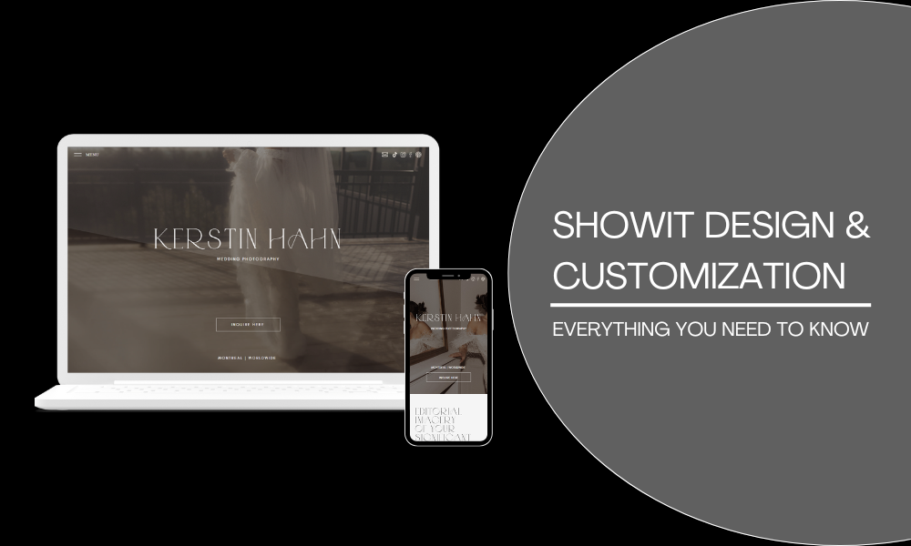
- Mobile Design: With more people browsing the web on their phones, ensuring your site looks good on mobile devices is crucial. Showit makes this easy by allowing you to design separate layouts for desktop and mobile. This means you can ensure your site is fully responsive and looks great no matter how it’s viewed.
Customizing Showit Templates
Templates are just the starting point with Showit. Once you’ve selected a template, the real fun begins—customization. Here’s how you can make your Showit template truly unique:
- Changing Colors and Fonts: Showit lets you customize the colors and fonts used throughout your site. Whether you want to match your site to your existing brand colors or experiment with something new, the process is straightforward. You can also upload custom fonts to ensure your typography is as unique as the rest of your design.
- Adjusting Layouts: Templates provide a basic structure, but with Showit, you’re not confined to that structure. You can rearrange elements, add new sections, or remove ones you don’t need. This flexibility is one of Showit’s biggest strengths, allowing you to create a site that feels completely custom.
- Adding Custom Graphics and Images: Images are a critical part of any website, especially if you’re a photographer or visual artist. Showit makes it easy to add custom graphics and images to your site. You can upload images directly from your computer, or pull them from Adobe Creative Cloud if you’re using that service.
Showit Drag-and-Drop Builder: A Complete Guide
The drag-and-drop builder is at the heart of what makes Showit so powerful. Here’s how to make the most of it:
- Understanding the Workspace: When you open the Showit builder, you’re greeted with a blank canvas that represents your website. This canvas is divided into different sections, such as the header, body, and footer. You can add elements like text boxes, images, buttons, and shapes to each section, and move them around as you see fit.
- Layering Elements: Showit allows you to layer elements on top of each other, giving you even more control over your design. For example, you can place text over an image or create overlapping sections that add depth and interest to your layout. Each element can be fine-tuned in terms of size, color, and positioning.
- Using Guides and Grids: While Showit’s design freedom is its biggest selling point, it also provides tools like guides and grids to help you keep things organized. These tools ensure that your elements are aligned and spaced correctly, which is especially helpful when designing complex layouts.
- Previewing Your Design: As you build your site, you can switch between desktop and mobile views to see how your design will look on different devices. This feature is invaluable for ensuring that your site is fully responsive and user-friendly.
Showit Mobile Design Tips
Mobile design is no longer optional—it’s a necessity. With more than half of all web traffic coming from mobile devices, ensuring your site looks great on smartphones and tablets is crucial. Here are some tips for creating a mobile-friendly design with Showit:
- Design for Thumbs: When designing for mobile, keep in mind how people interact with their devices. Elements like buttons and links should be large enough to tap easily with a thumb. Place important actions like navigation and calls to action within easy reach.
- Simplify Your Layout: Mobile screens are smaller, so simplicity is key. Avoid cluttering your mobile design with too many elements. Stick to a clean, streamlined layout that’s easy to navigate.
- Optimize Images: Large images can slow down your site on mobile devices. Showit allows you to upload different images for your mobile and desktop sites, so you can use smaller, optimized images on mobile without sacrificing quality.
- Test Across Devices: Showit’s preview feature lets you see how your site will look on various devices, but it’s also a good idea to test your site on actual smartphones and tablets. This will give you a better sense of how your design works in the real world.
If you’re new to mobile design, our blog on Showit for Beginners is a great place to start, offering a step-by-step guide to setting up your site for success on all devices.
Integrating Custom Fonts in Showit
Typography is a powerful tool in web design. The right font can elevate your site’s look and feel, making it more engaging and readable. Showit allows you to integrate custom fonts into your design, giving you complete control over your site’s typography.
- Uploading Custom Fonts: To add a custom font to your Showit site, simply upload the font file (in formats like .ttf or .otf) to the platform. Once uploaded, the font will be available in the Showit editor, allowing you to apply it to any text element on your site.
- Google Fonts Integration: Showit also integrates with Google Fonts, giving you access to a vast library of free, web-safe fonts. This is a great option if you’re looking for a specific style but don’t have a custom font in mind.
- Typography Best Practices: When choosing fonts, it’s important to consider readability. Decorative fonts can add personality, but they should be used sparingly, especially in body text. Stick to clean, easy-to-read fonts for most of your content, and save the fancy stuff for headings and accents.
Advanced Showit Design Features
Once you’ve mastered the basics of Showit, it’s time to explore some of the platform’s more advanced features. These tools allow you to take your design skills to the next level and create a truly unique website.
- Animations and Effects: Showit allows you to add animations and effects to your site, such as fade-ins, slide-ins, and parallax scrolling. These features can add a dynamic feel to your site and keep visitors engaged.
- Custom Code Integration: If you have coding skills, or you’re working with a developer, Showit allows you to add custom code to your site. This opens up endless possibilities for customization, from integrating third-party tools to creating unique design elements.
- Interactive Elements: Showit supports interactive elements like hover effects, clickable buttons, and image sliders. These features can enhance the user experience and make your site more engaging.
Showit vs. Custom Coding: Which Is Better?
One question many designers face is whether to use a platform like Showit or build a website from scratch using custom code. Here’s a quick comparison:
- Ease of Use: Showit is much easier to use than coding a website from scratch. It’s designed for people who want to create beautiful websites without needing technical skills. Custom coding, on the other hand, requires knowledge of HTML, CSS, and JavaScript, and it can be time-consuming.
- Design Flexibility: Both Showit and custom coding offer high levels of design flexibility. However, Showit’s drag-and-drop interface makes it easier to experiment with different layouts and designs, while custom coding allows for more precise control over every detail.
- Time and Cost: Showit allows you to build a website quickly and without needing to hire a developer, making it a cost-effective option for many. Custom coding is more expensive and time-intensive, but it might be worth it if you need a completely unique site with specific functionality.
- Scalability: Custom-coded websites are often more scalable and can handle complex features and large amounts of traffic more effectively. Showit is perfect for most small to medium-sized websites, but for larger projects, custom coding might be necessary.
How to Create a Showit Blog Design
If you’re planning to start a blog, Showit makes it easy to design a blog layout that’s both beautiful and functional. Here’s how to get started:
- Choose a Blog Template: Showit offers blog-specific templates designed to work seamlessly with WordPress. Choose a template that fits your style, and then customize it to match the rest of your site.
- Customize Your Blog Layout: Use Showit’s drag-and-drop editor to customize your blog’s layout. You can adjust the width of your content area, add or remove sidebars, and choose how many posts to display on your blog’s homepage.
- Design Individual Post Pages: Each blog post should have a design that’s consistent with the rest of your site. Customize the post page template to include features like social sharing buttons, author bios, and related posts.
- Optimize for SEO: Make sure your blog is optimized for search engines by using proper headings, alt text for images, and meta descriptions. Showit integrates with WordPress, so you can also take advantage of SEO plugins like Yoast to further optimize your content.
For more tips on creating an SEO-friendly blog, be sure to read our upcoming post on Showit SEO.
Final Thoughts
Designing a website with Showit is a journey filled with creativity and customization. Whether you’re starting with a template or building from scratch, Showit’s powerful design tools give you the freedom to create a site that’s uniquely yours. From basic layouts to advanced features, this platform has everything you need to bring your vision to life.


